Shipped product · UI/UX internship · 2025
Magic Bubu
AI tarot shaped by Eastern aesthetics
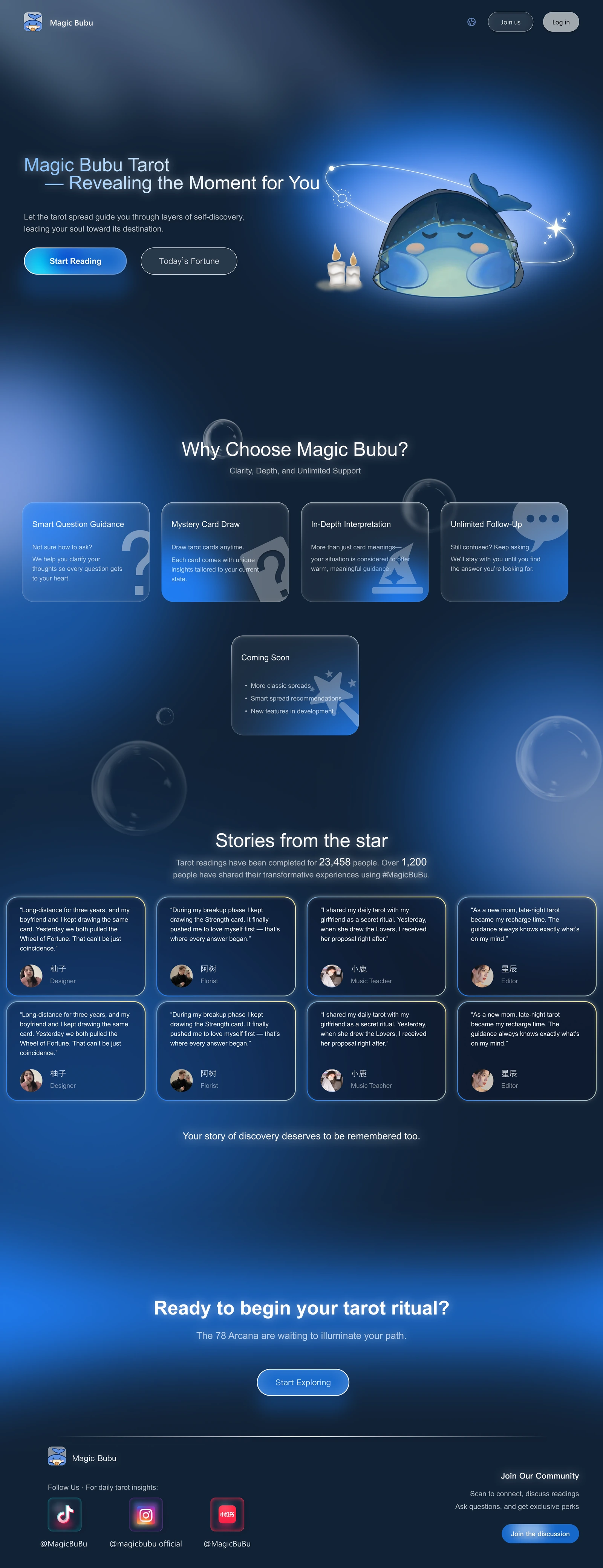
Magic Bubu helps people explore uncertainty and confusion through AI-guided tarot readings, with an interface shaped by Eastern aesthetics and a whale companion.
As a UI/UX Design Intern, I helped shape the core flows and refine guidance, card drawing and visual consistency through research with 50+ seed users.
- Company
- Shenzhen Chiri Technology Co., Ltd.
- Role
- UI/UX Design Intern
- Time
- March–December 2025
- Audience
- Chinese seed users;
international expansion in view - Website
- magicbubu.com ↗
- 28 days
- To MVP launch
- 3,000+
- Users in the first month
- RMB 50M
- Valuation · iFLYTEK technical resources for 5% equity
- Most Artistic Award
- AI Agent 2025 · Team recognition
Scroll within the screen to explore.Swipe within the screen to explore.

02 / Product context
The AI boom meets the search for meaning
The generative AI boom
$33.9BGlobal private investment in generative AI, 2024
Up 18.7% from 2023, opening new possibilities for conversational AI.
Stanford AI Index, 2025 ↗Divination has a broad audience
30%Of U.S. adults use astrology, tarot, or fortune tellers at least annually
Most participate for fun. This shows a sizeable audience for symbolic, personal experiences—an opportunity for a digital tarot product to explore.
Pew Research Center, 2025 ↗Conversational AI × the personal ritual of tarot
Magic Bubu combines AI-guided interpretation with the ritual of tarot, in a visual world shaped by Eastern aesthetics.
03 / Design challenge
How can AI tarot feel intuitive and personal?
Tarot reading relies on ritual, symbolism and interpretation. But when translated into a digital product, these qualities can easily become friction.
Immersion
Preserve the feeling of tarot
Create an experience that feels engaging rather than purely functional.
See the immersion solutionClarity
Make the ritual easy to understand
Help first time users understand what to do next without prior tarot knowledge.
See the clarity solutionRelevance
Make the reading respond to the user
Connect the user’s question, selected cards and AI interpretation so the result feels specific rather than generic.
See the relevance solution04 / Key design decisions
Within the 28 day MVP timeline, research with 50+ seed users helped us focus on three parts of the experience: how tarot should feel, how the ritual should flow, and how each interpretation could stay connected to the user’s question.
50+seed users in research
Research methods used with these users
- One-to-one interviews
- Offline roadshows
- Questionnaires
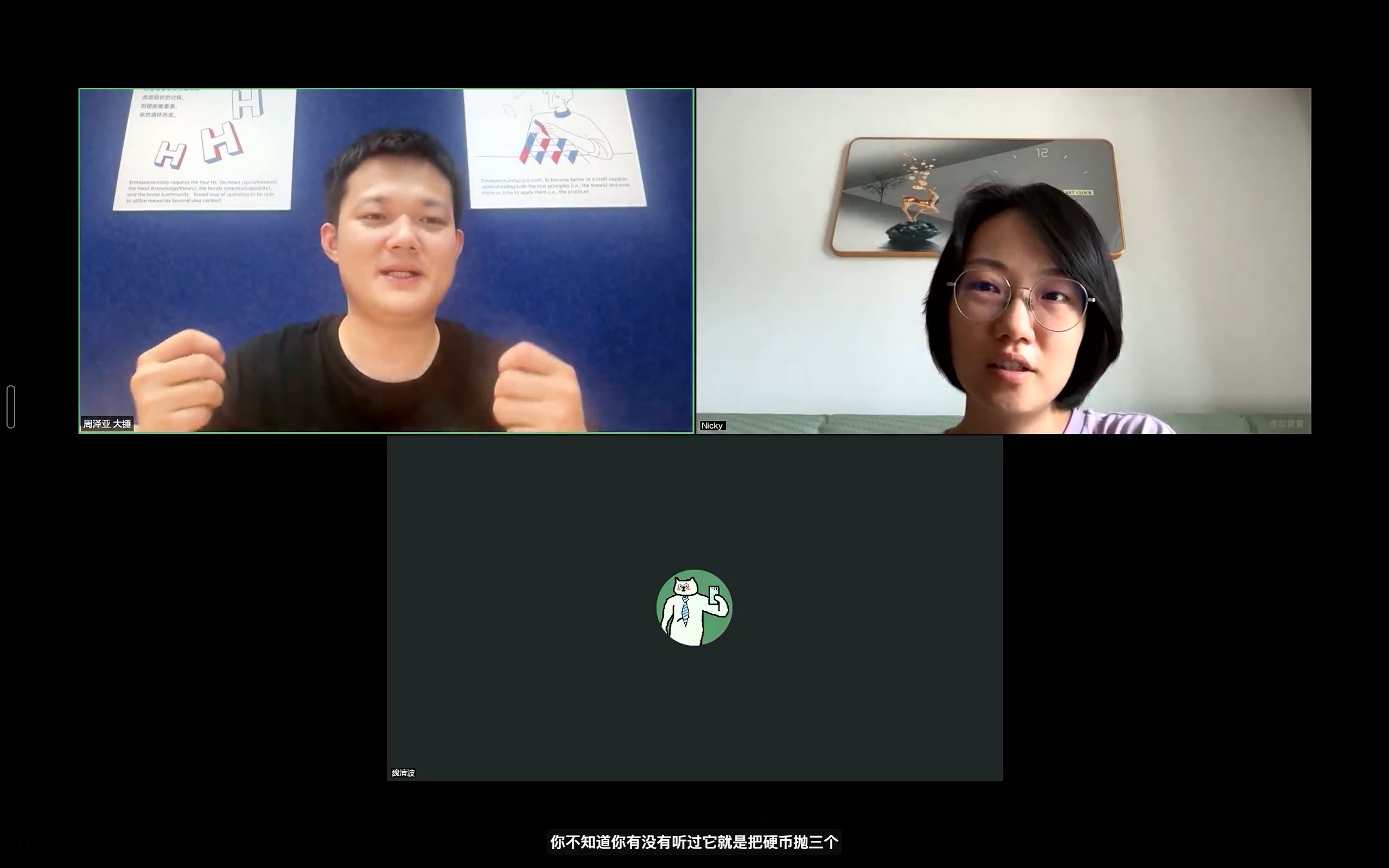 One-to-one interviews
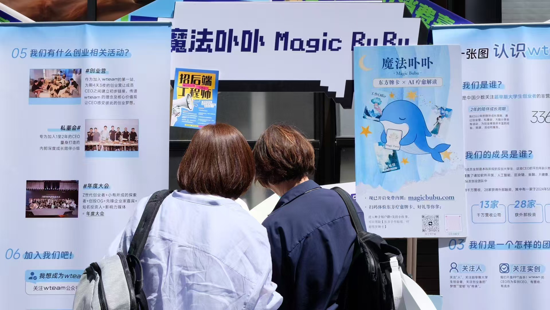 Offline roadshows
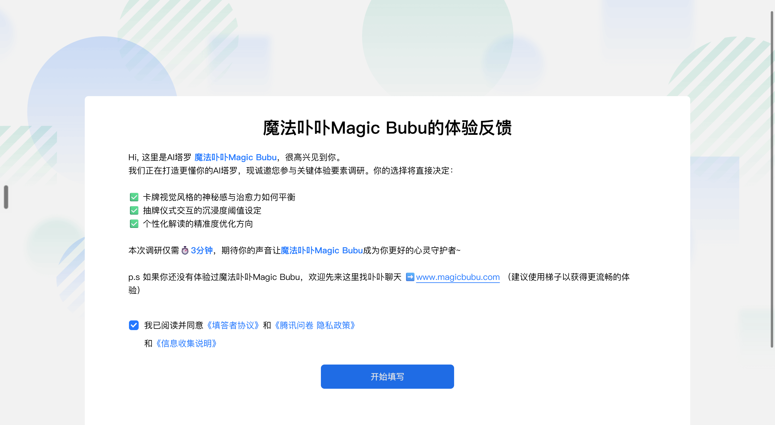 Questionnaires / 01
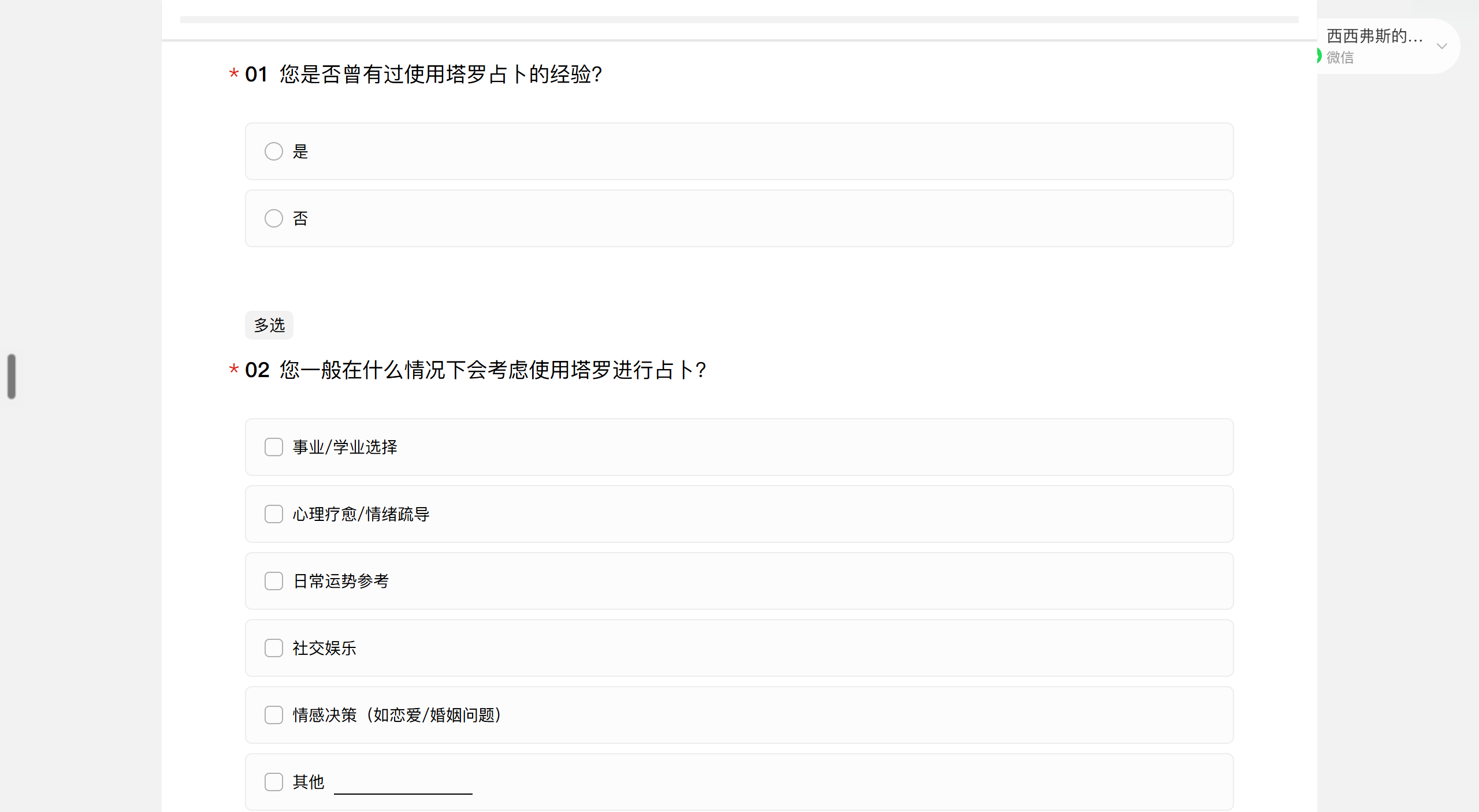 Questionnaires / 02
Decision 01
Immersion Build a world around the reading
The visual experience should preserve the feeling of tarot. Eastern aesthetics, the whale companion and the drawing atmosphere make the reading feel engaging rather than purely functional.
Tarot shaped by Eastern aesthetics
To give Magic Bubu a distinct identity beyond familiar Western tarot, we reinterpreted the deck through Eastern aesthetics, using painterly landscapes, flowing water and symbolic motifs. Deep blue, warm gold and shared card borders then extend this visual language from the 78 cards into the interface.
78 cards, one visual language
Scroll through the deck on the left. Choose a card to reveal its artwork on the right.
Scroll to explore
all 78 cards
Choose a card to reveal its artwork.

A whale to guide the journey
We created a small whale companion as both fortune teller and guide. Its expressions give the experience a consistent presence from the first question through the reading.
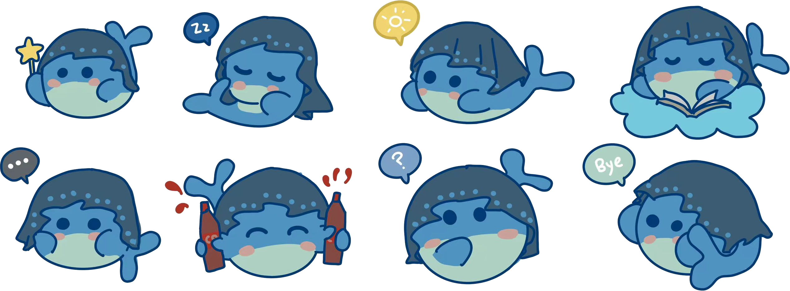
Let people take part in the draw
In an in-person tarot reading, choosing the cards is part of the ritual. People draw cards by themselves, while candles, a crystal ball, layered waves and background music sustain the atmosphere around the action.

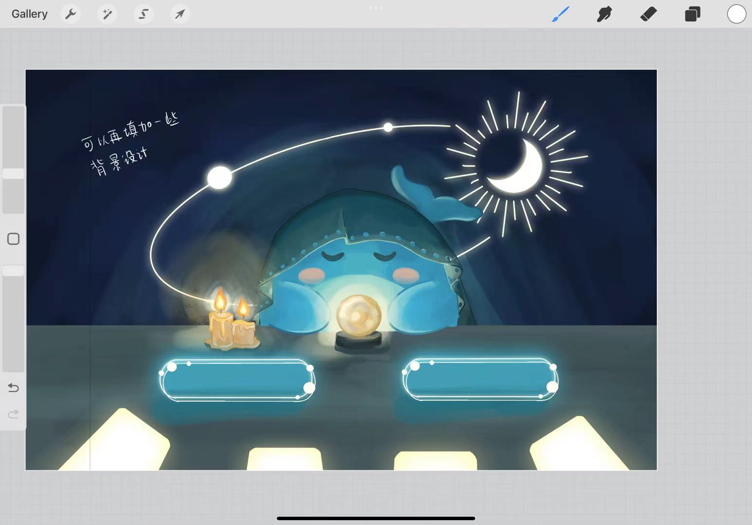
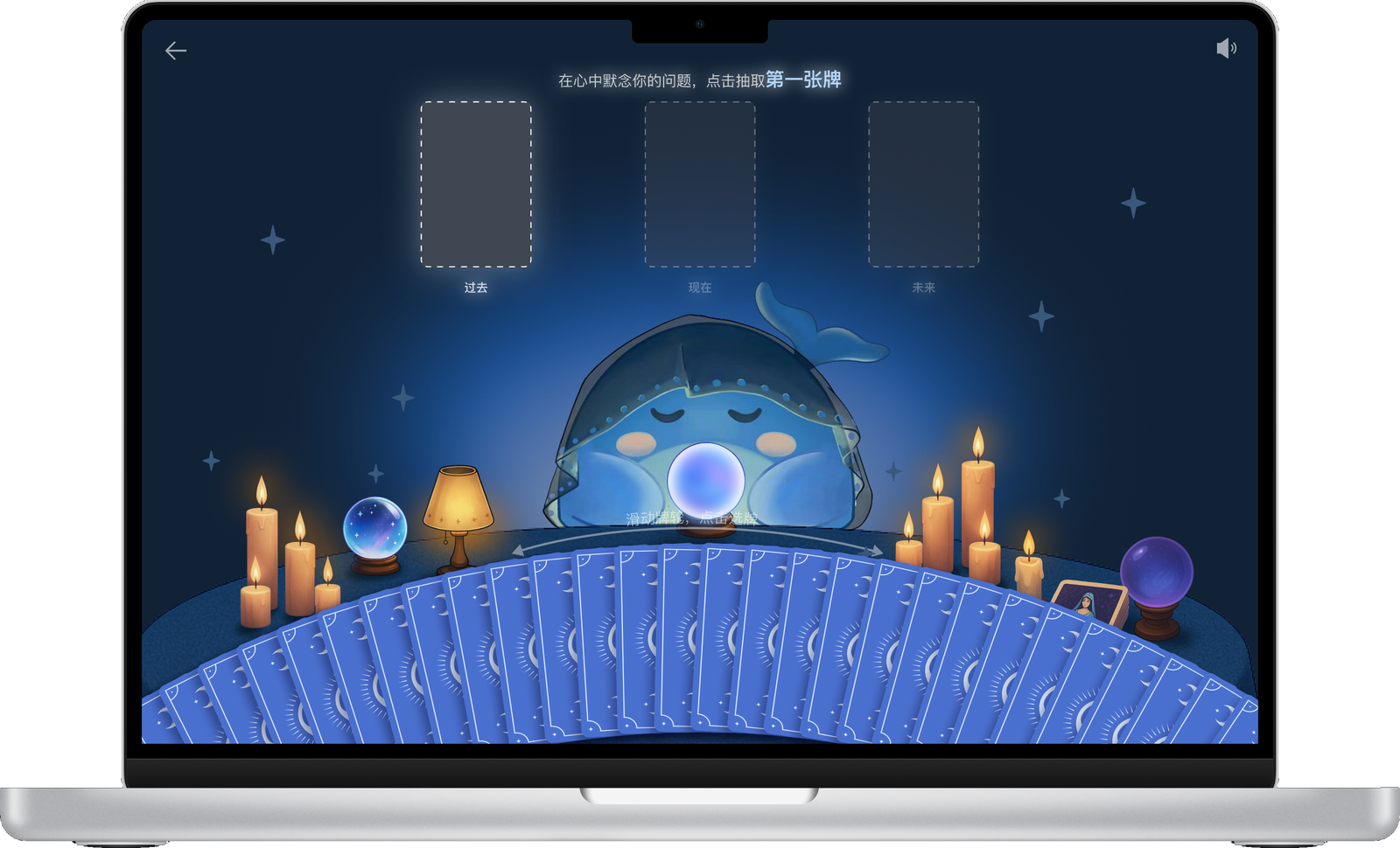
Decision 02
Clarity Make the ritual easy to follow
The interaction flow guides first time users from asking a question to drawing cards and reading the result. Prompts, visible progress and immediate feedback make the next step clear without prior tarot knowledge.
- 01Ask
- 02Draw
- 03Read
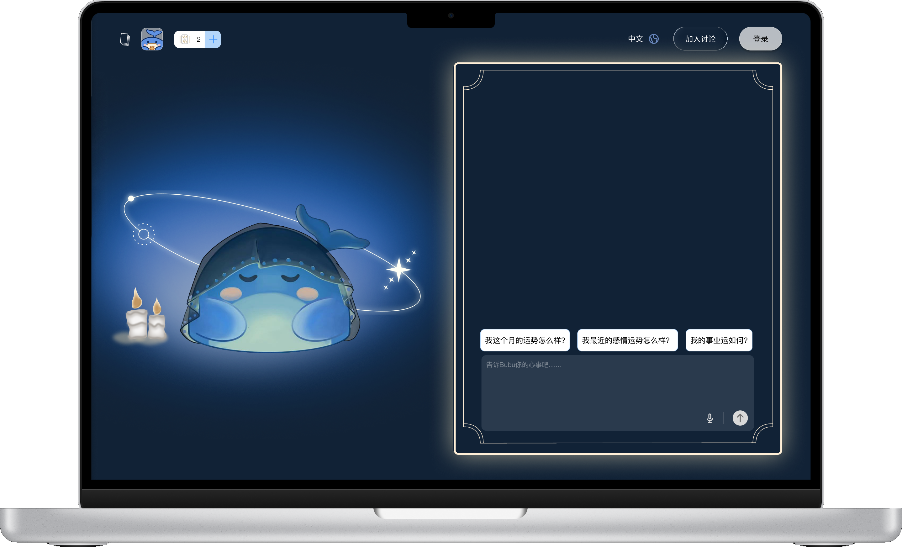
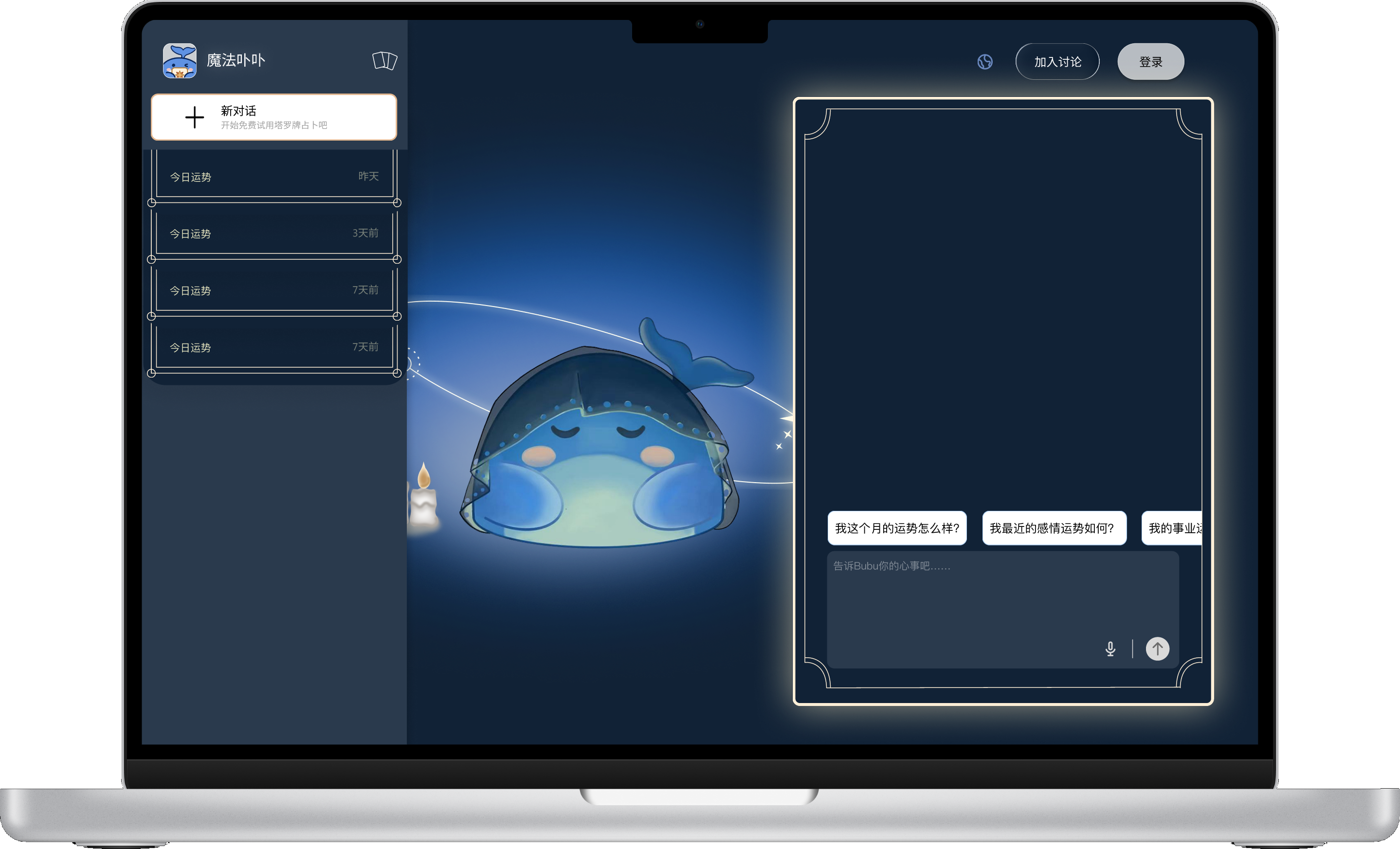
Start with a question
Suggested questions help people begin, while free-form input lets them ask in their own words. The chat panel keeps the question visible, and the sidebar lets them return to earlier conversations.
Show progress within the ritual
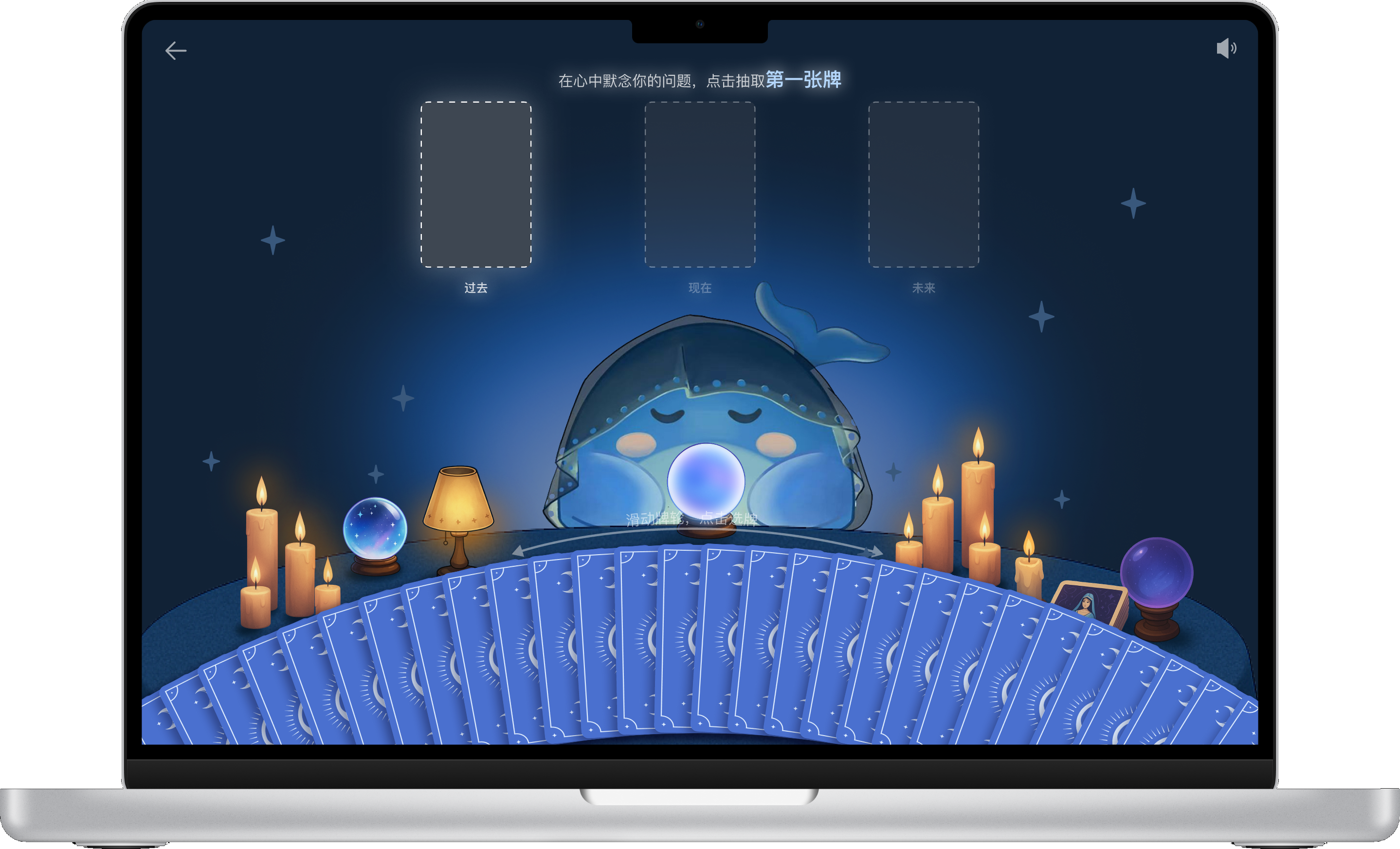
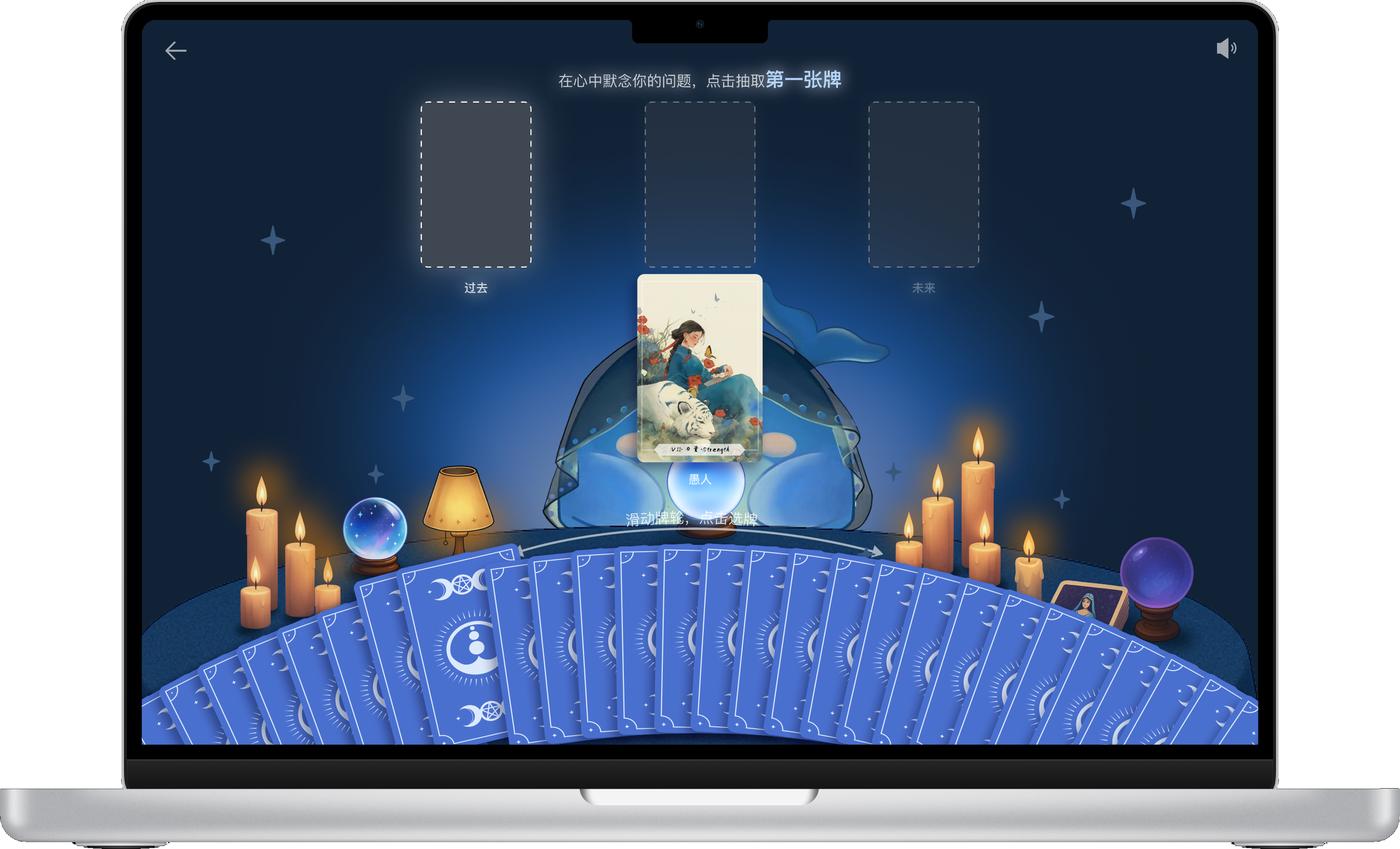
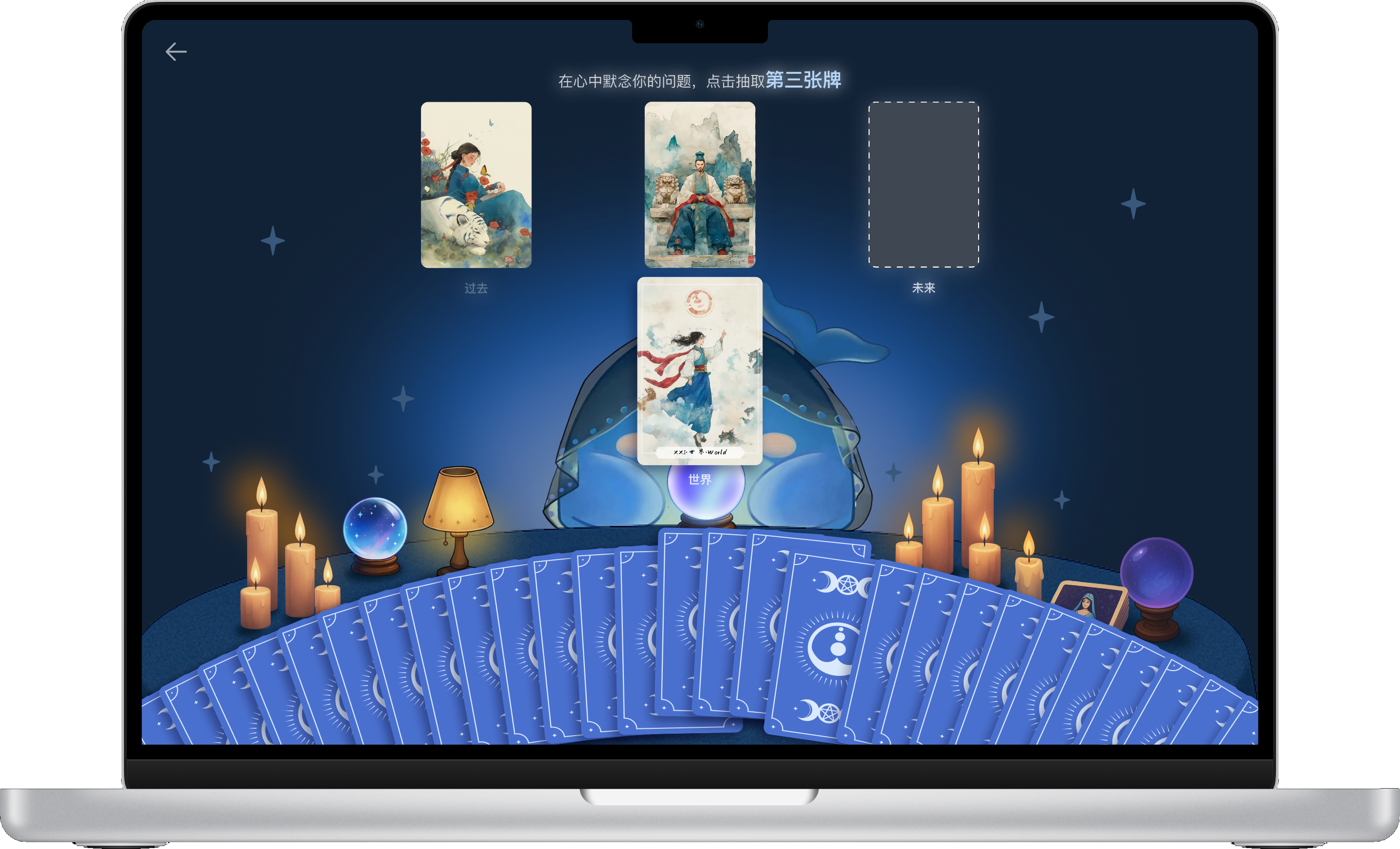
A highlighted slot shows which card to choose next. Each selection reveals a card and fills a position, giving visible feedback until the spread is complete.
Explore the card-drawing interaction. Choose a stage below to see how selection, reveal and progress work together.
Return to the reading
When the spread is complete, the selected cards and AI response appear in the conversation. Users can read the result, open a card detail or ask a follow-up.
Decision 03
Relevance Keep the reading tied to the question
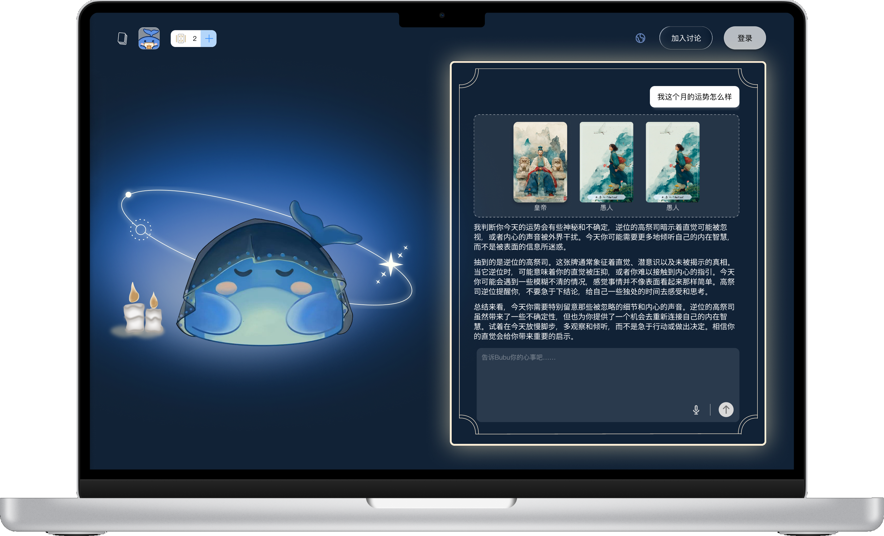
A tarot reading becomes meaningful when the interpretation feels connected to what the user actually asked. We kept the original question, selected cards and AI interpretation within the same reading context, while allowing users to explore individual card meanings or continue the conversation.
The question stays with the reading
The original question remains visible alongside the selected cards and interpretation, helping users understand the answer in relation to what they asked.
- Question
- Selected cards
- AI interpretation
Two layers of interpretation
The overall reading responds to the user’s question, while selecting an individual card reveals its broader symbolism. This separates contextual interpretation from general tarot knowledge.
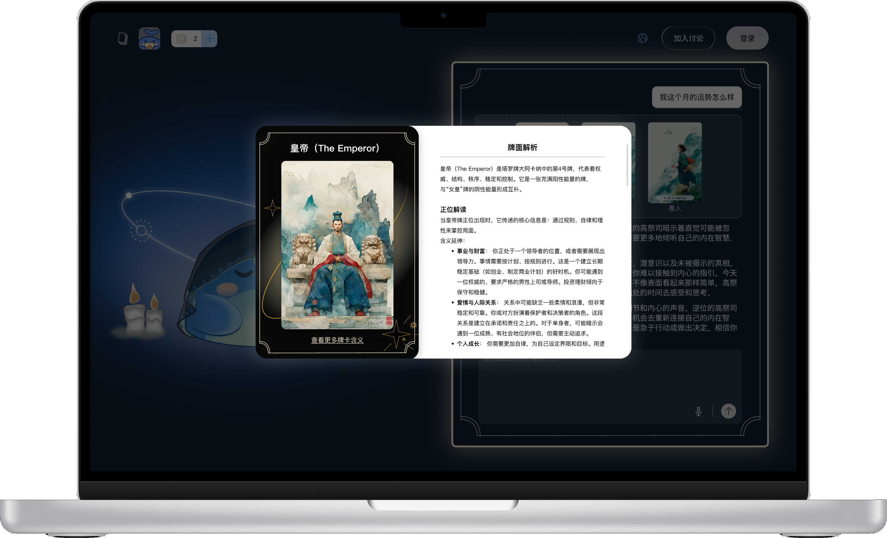
- Contextual reading
- Specific to this question
- Card meaning
- General symbolism
Continue the reading
A follow up input lets users explore the interpretation further without starting a new reading, keeping the conversation connected to the same question and cards.
Supporting product functions
Beyond the core reading experience, account access, sharing and paid plans support continued use and product growth.
Sign in to continue
The account panel presents email, Google and Apple sign-in together.

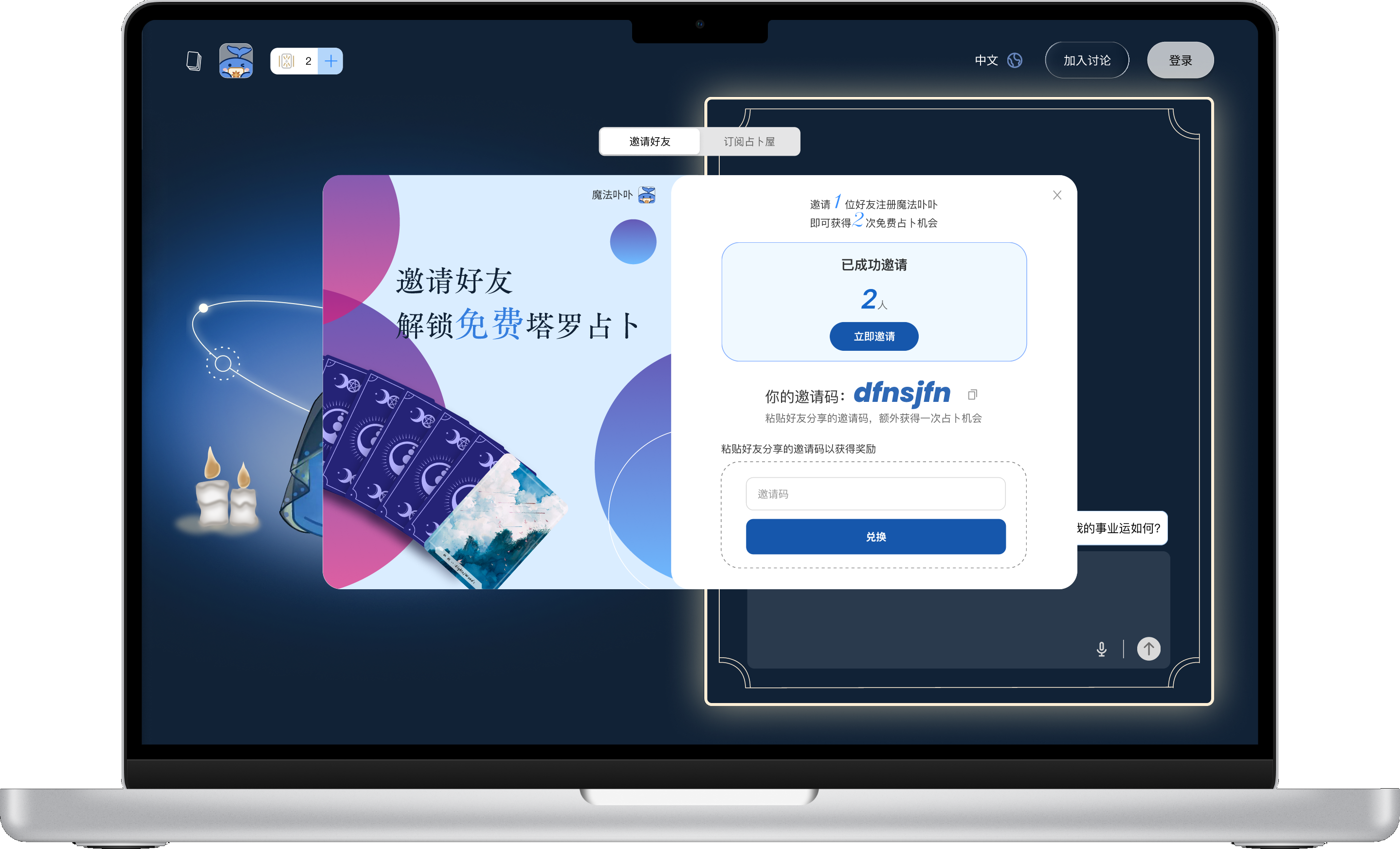
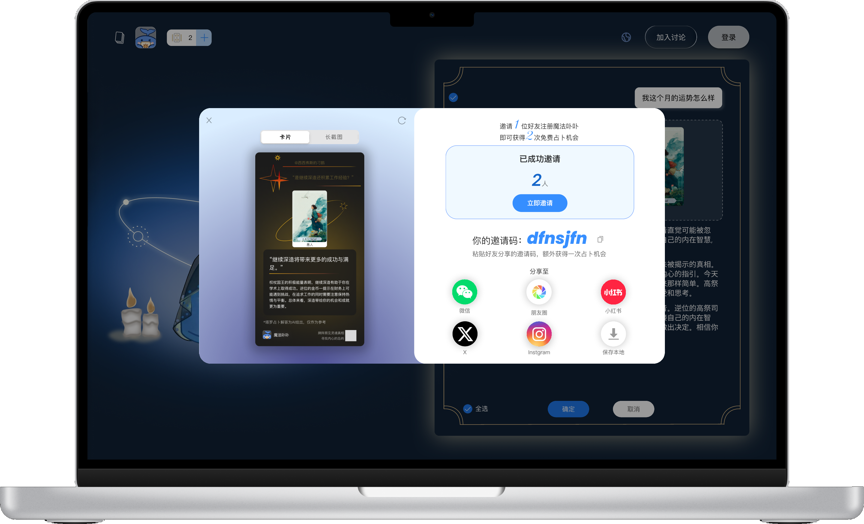
Invite a friend. Share a reading.
01 / Invite codes
Invite a friend to enter your code and receive additional card draws. The code, reward, and invitation progress are shown together.
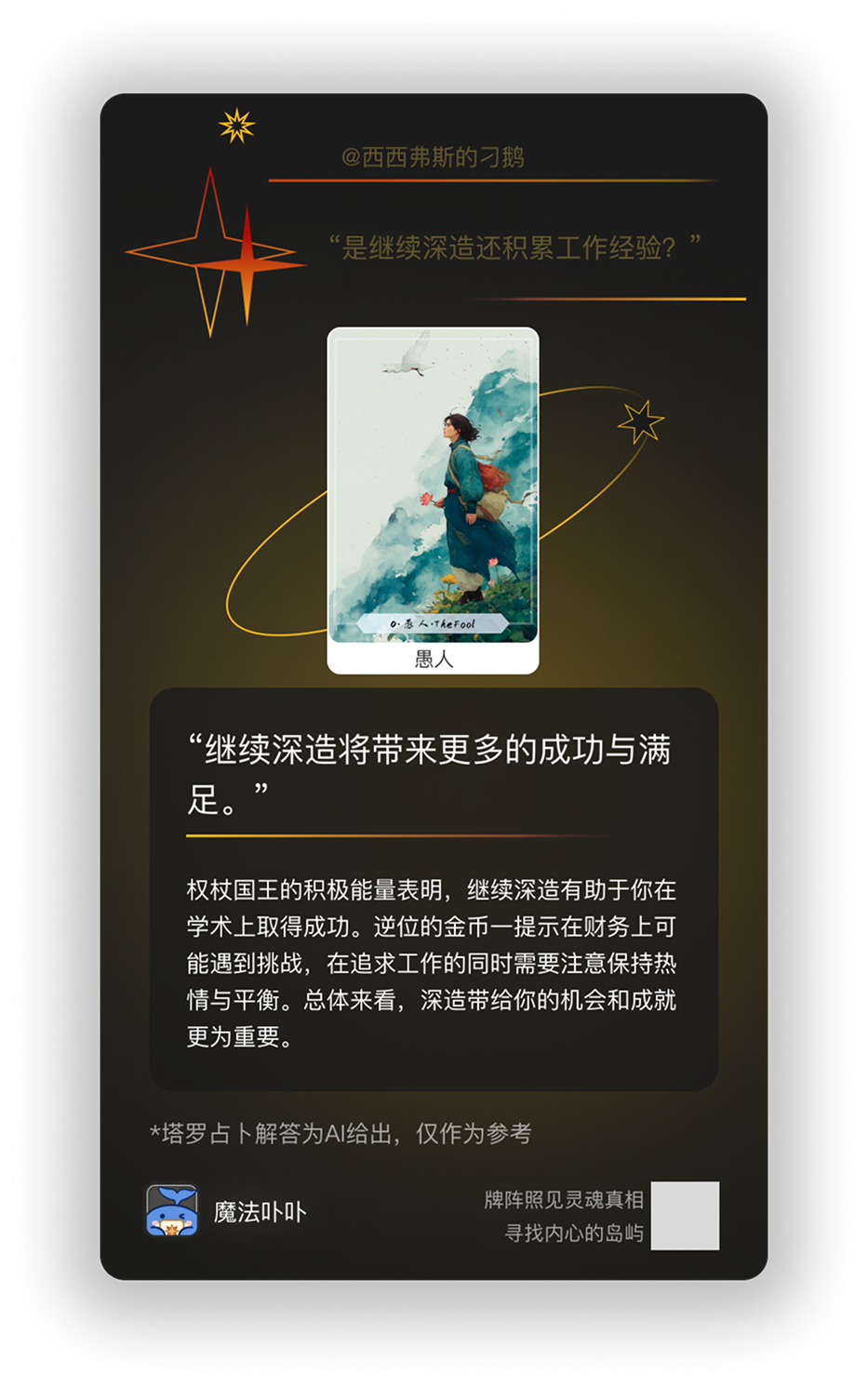
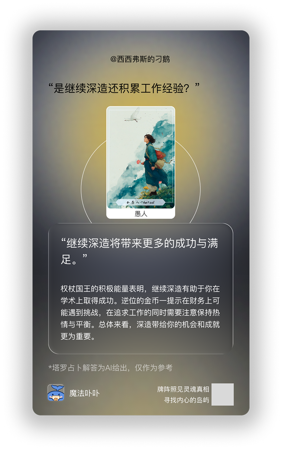
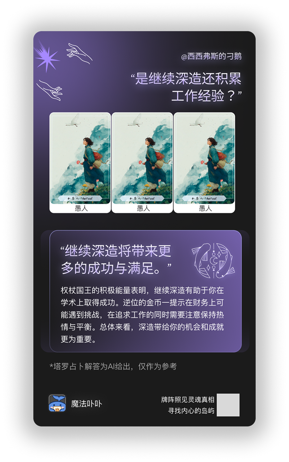
02 / Shareable reading cards
Turn a reading into a card to save or share. The preview and sharing options create another route for friends to discover Magic Bubu.
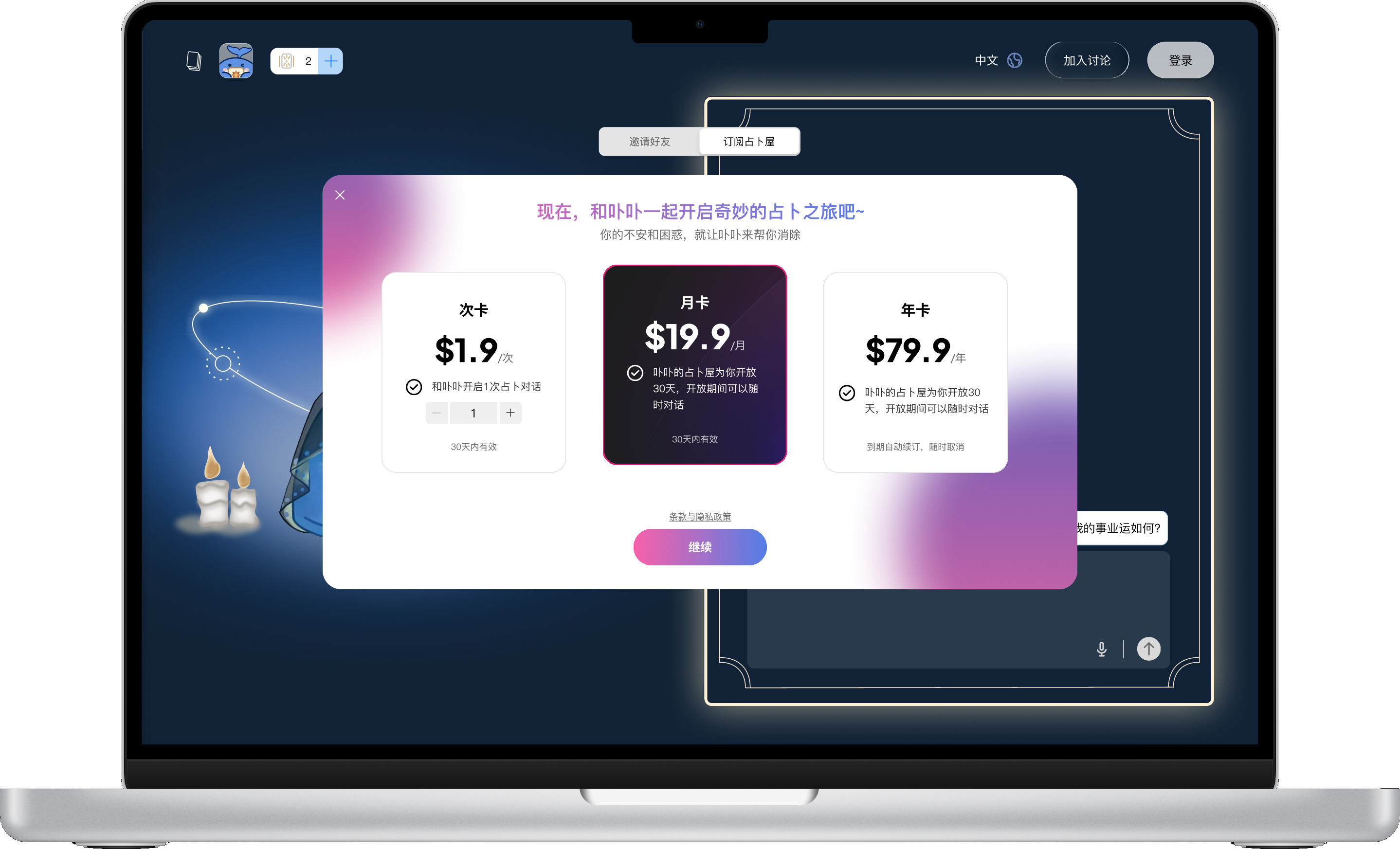
Subscriptions for continued reading
Monthly and annual subscriptions sit alongside a single-reading option, making the access choices easy to compare.
05 / Shipping & collaboration
From design to release
Figma handoff was one part of the work. I used feedback and annotated implementation reviews to refine the product with the product manager and developers.
- 01Listen and observe
Interviews and usability sessions surfaced priorities.
- 02Refine the experience
Prompts, card drawing and visual consistency changed through iteration.
- 03Discuss feasibility
I worked through constraints with the product manager and developers.
- 04Review implementation
Annotated issue reports helped align the built interface with the design.
- 05Prioritise the next release
The MVP shipped in 28 days, with 10+ post-launch iterations.
06 / Outcome
A live product, refined through feedback
Launched in 28 days and refined through 10+ iterations.
- MVP launch
- 28 days
- Seed users in research
- 50+
- Post-launch iterations
- 10+
- Users in the first month after launch
- 3,000+
External support and recognition
iFLYTEK · Technical investment
Backing for the next stage
iFLYTEK provided technical resources under a 5% equity arrangement at a RMB 50 million valuation. Magic Bubu was also included in its developer ecosystem.
AI Agent 2025 · Competition recognition
Most Artistic Award
The Magic Bubu team received the Most Artistic Award (最具艺术奖) and a completion honour certificate (通关荣誉证明) in the 2025 AI Agent Global Special Competition of the 3rd National AI Application Scenario Innovation Challenge ↗.
Century Huatong profiled Magic Bubu
Published during the Digiloong Cup, the founder interview covered Magic Bubu's AI tarot concept, its role in personal reflection and its blend of tarot symbolism with Eastern cultural references.
Read the original report ↗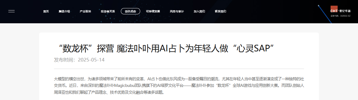
07 / Reflection
What this project taught me
Clarity makes room for ritual
I learned to treat guidance as part of the experience. Clear prompts and visible feedback let users focus on choosing and interpreting cards, without having to work out the interface.
Visual identity works best through interaction
The whale and original deck gave the product its character. Translating card shapes into dialogue and reading history taught me how a visual idea can also organise an interface.
Shipping is a shared design process
A short launch window made prioritisation essential. Working with the product manager and developers taught me to communicate design intent clearly, respond to constraints, and use feedback to guide each iteration.
I learned to connect the details of an interaction with the feeling of the whole experience.